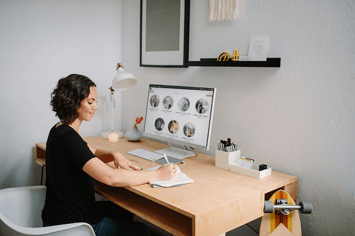
Doing a website review after you’ve spent time building your website can be a chore. That’s why I’m here.
According to the 2019 WeddingWire newlywed report, over 80% of millennials plan their weddings online. And according to that same report, 64% of newly engaged couples announce their engagement on social media within hours of their proposals.
It is therefore essential that as an Event and Wedding Planner, that your online presence, i.e. website and social media are effectively marketing to your potential clients. To win at the online marketing game, however, you do need to ensure that your website content is speaking to your customers and that your social media channels are serving their purpose, which is to help you book more event planning clients.
By request, today I want to offer a website review and audit of an Event Planner’s website, An Event Lady Production founded by Angela, to see how her website ranks and what can be improved to generate more event planning leads online.
Let’s dive in:
Website Review – At First Glance
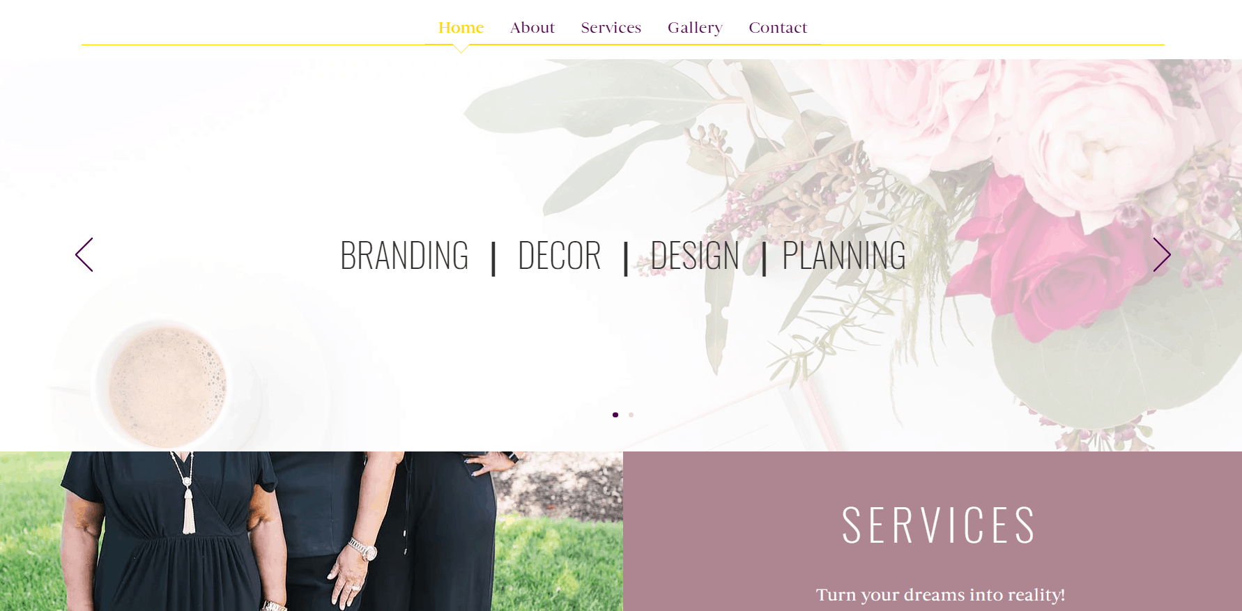
The first thing that I focused on when I entered the website was the top menu bar. The website has five pages, which I absolutely love as it is clear to potential clients where they should go to take action. That is:
- Home
- About
- Services
- Gallery
- Contact
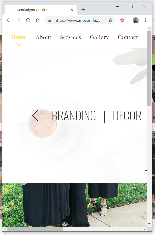
The second thing I notice however is the main website image slider, an image of three people standing together on the lower left and a services heading to the lower right. This immediately pulled my eyes in three different places and divided my attention.
Recommendation: This menu gets an A+ in my books, however, I would suggest extending the height of the slider image to fill the page, so there isn’t that split screen effect of three different focal points. This can be distracting for website visitors.
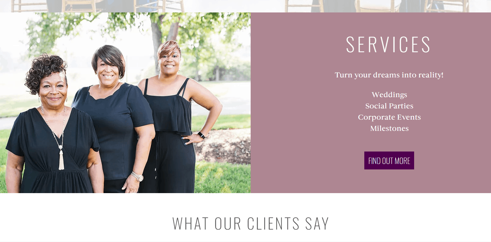
Scrolling further down the home page I am greeted with the smiling faces of three lovely ladies (including the owner Angela!). I love this image as it immediately introduces you to the faces behind the company. This view is then split with a services block that includes the generic phrase often used by event planners on their website “Turn your dreams into reality”.
Recommendation: Remove the services block and make the photo of the three ladies the center of this section of the website. I would also recommend replacing the term “Turn your dreams into reality” with copy that is more specific to your target clients. For example: “Let us take care of the planning for you, while you share a laugh with mom as she helps you into your wedding dress”.
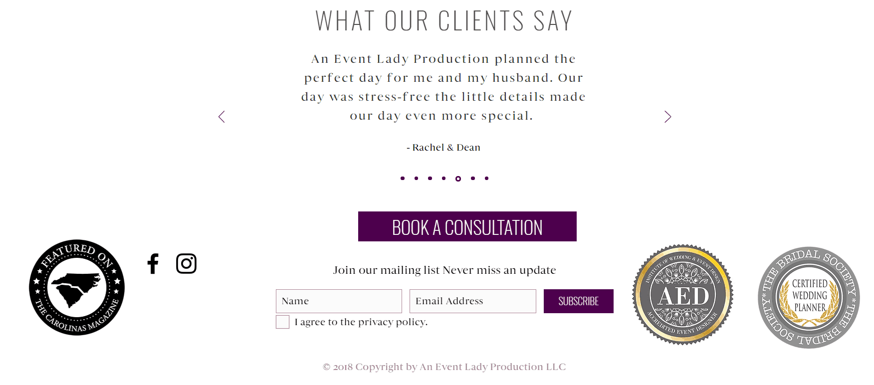
The third section of the home page is by far my favorite part of the website. That is because it includes social proof! When marketing your business online where customers are not able to immediately see your face and get a feel for your personality and trustworthiness, it is crucial to share testimonials and awards as a way to showcase your expertise and build trust. The client reviews and badges in this section do just that.
Recommendation: This area gets an A+. My only suggestion is to update the copyright in the footer to the current year. For the home page I would also strongly suggest creating a free download that will grab visitors’ email addresses, so you can follow up with them.
About Page – Website Review
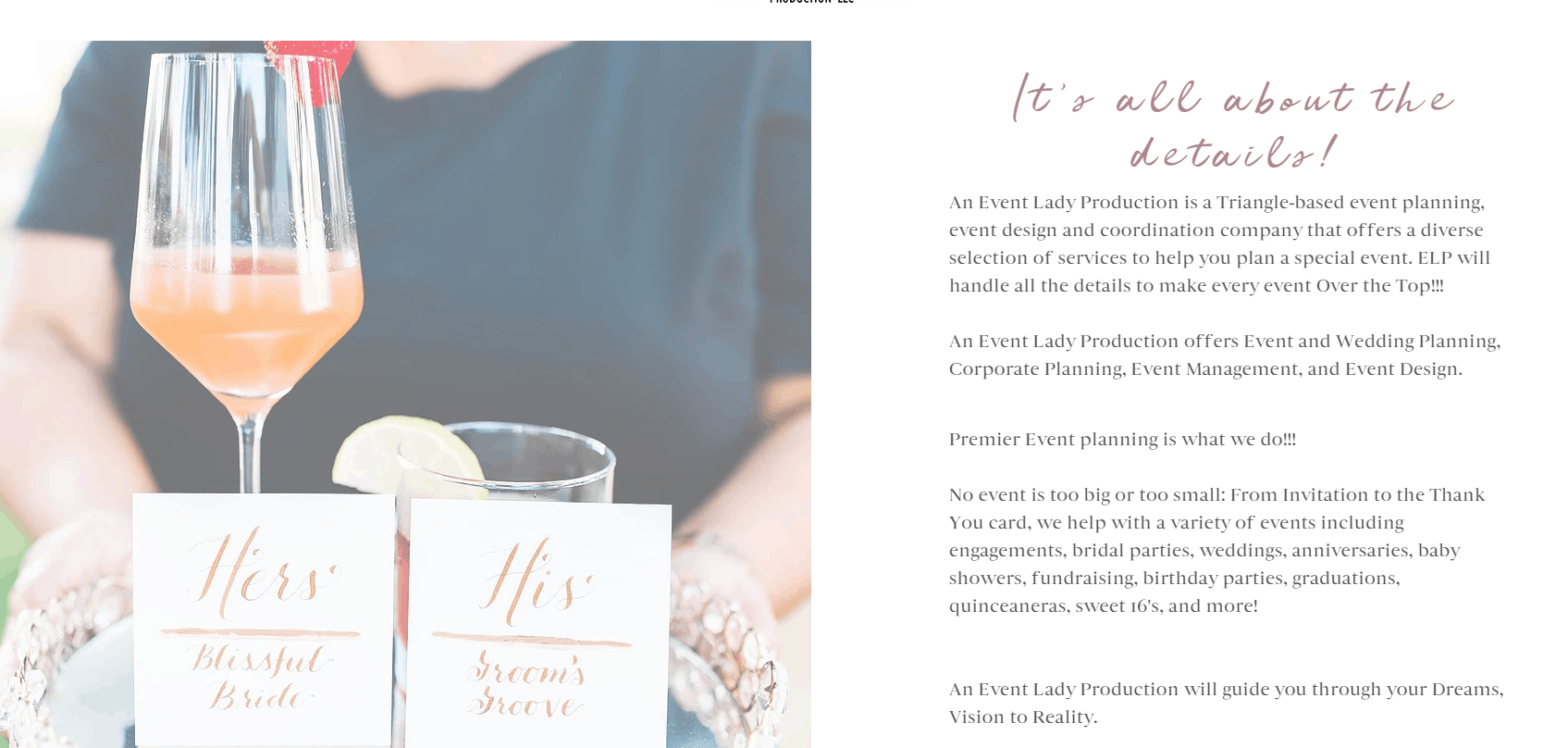
The first half of the about page (pictured above on the left) does need to be reworked. Until you scroll to a certain point in the page, the image on the left-hand side with the wine glass actually remains blurred, which is not visually appealing, and the introduction paragraph on the right-hand side has too many exclamation points, that sounds like someone is shouting at me about how amazing the company is. Again, the copy on this page includes the common event planner generic words such as “dreams”, “vision” and “reality”, which does not speak to potential clients.
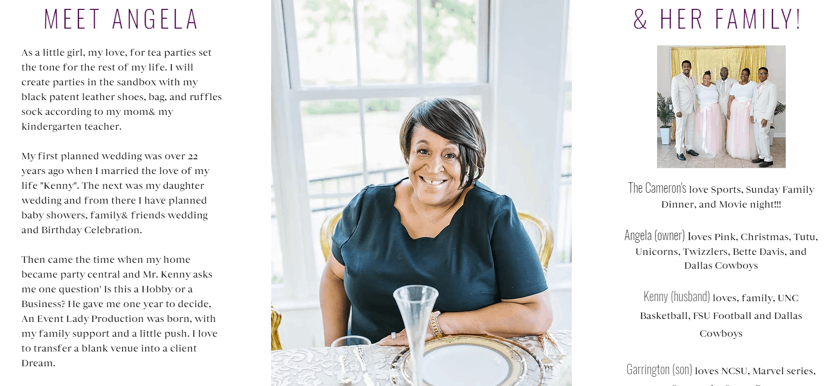
On the lower half of the About page (pictured above on the right), we get an introduction to Angela, the beauty behind the business and a glimpse into her family. I enjoyed seeing Angela’s smiling face, as well as learning a bit more about her family. The website copy on this half of the page is much more effective than the first. We get a glimpse into what Angela enjoys and how she became an event planner. What this introduction is missing, however, is the connection back to the company’s potential clients.
During my client’s website review, I often ask one question “why should I care?”.
Whenever a potential client visits your website they are doing so because they are thinking about hiring a wedding planner and are researching their options. As a result, the content on your website needs to answer this question, otherwise, all you are left with are a bunch of words that do nothing to convert a visitor into a paid client. My question to Angela then is this, Why should potential clients care that you were given a deadline by your husband to make your business full-time? If your content is not addressing this, then it can be removed from the site.
Recommendation: Shorten the company introduction section to provide an overview of the company and services offered, and remove the multiple exclamation marks. Also Angela’s background story should be condensed and connected to the reasons why a client should hire her.
At the end of the about page is the company’s contact information, very clearly listed, as well as a contact form. This is very well done and what I recommend all clients include on their contact pages.
Recommendation: My only recommendation here would be to not use the “info@” email address, though this is unrelated to the website itself. Email service providers such as Google will tend to list “info@” email addresses as spam, and emails you send to potential clients could end up in the promotions folder.
Services Page – Website Review
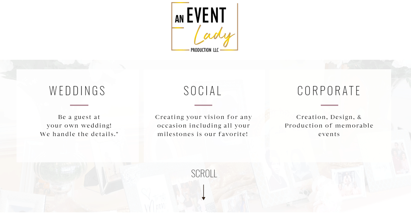
The services page here is an interesting one. The company breaks down their services into three offerings, Weddings, Social Events, and Corporate Events, however to see what each includes you have to keep scrolling to view.
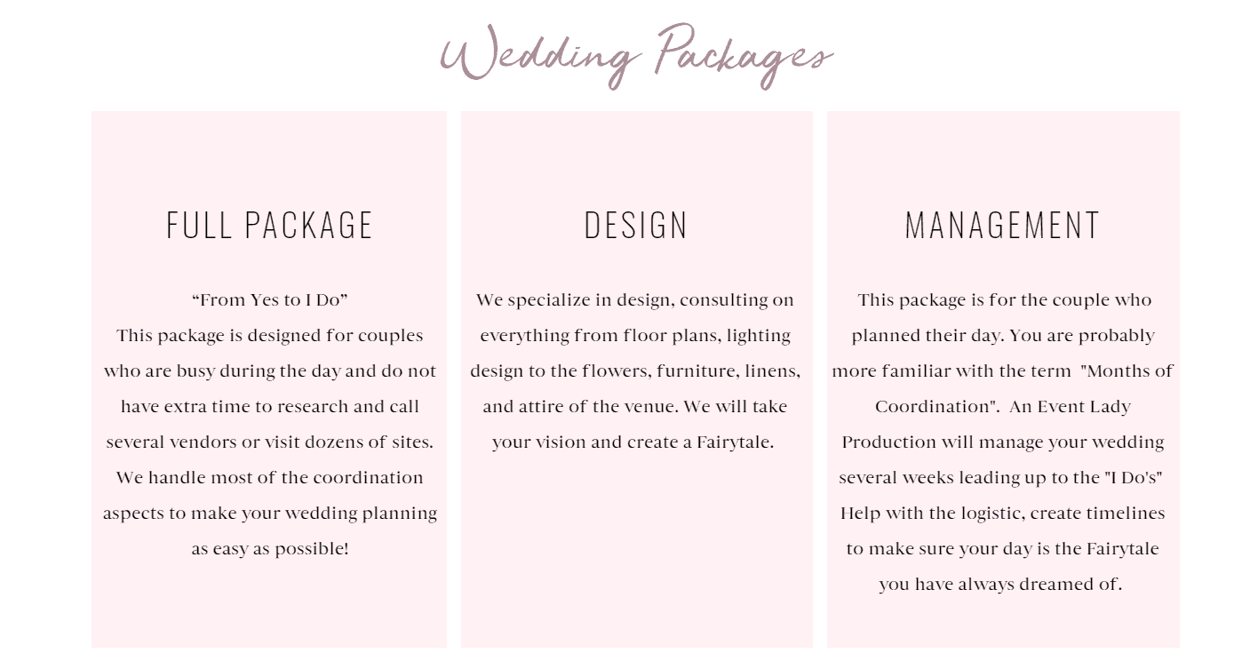
Above is an example of what you will see when you keep scrolling down the page. Under wedding packages, we have three “packages” listed, and I have this in quotation marks because I am unaware if these are packages themselves or just the type of services offered to wedding clients.
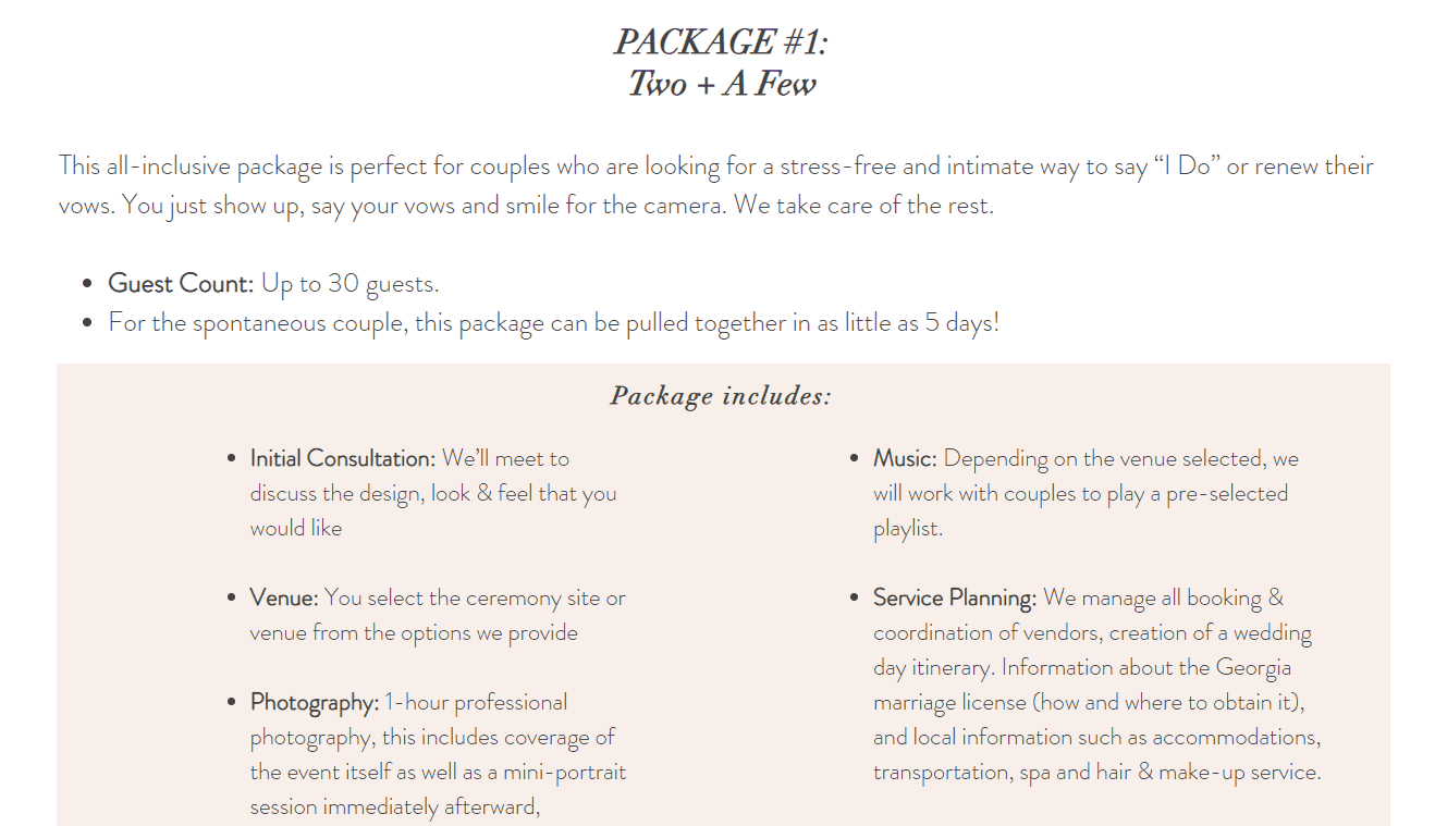
Recommendation: If you are splitting your services into three categories, i.e. Wedding, Social and Corporate. The best web design practice would be to have one page that list all three with a description and then have each one linked to their separate pages which outlines the packages AND a starting from price. Potential clients should be able to read a package description and clearly tell if this is what they need. Here is an example of a package that is clearly outlined:
Gallery Page – Website Review
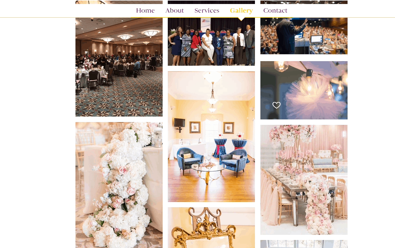
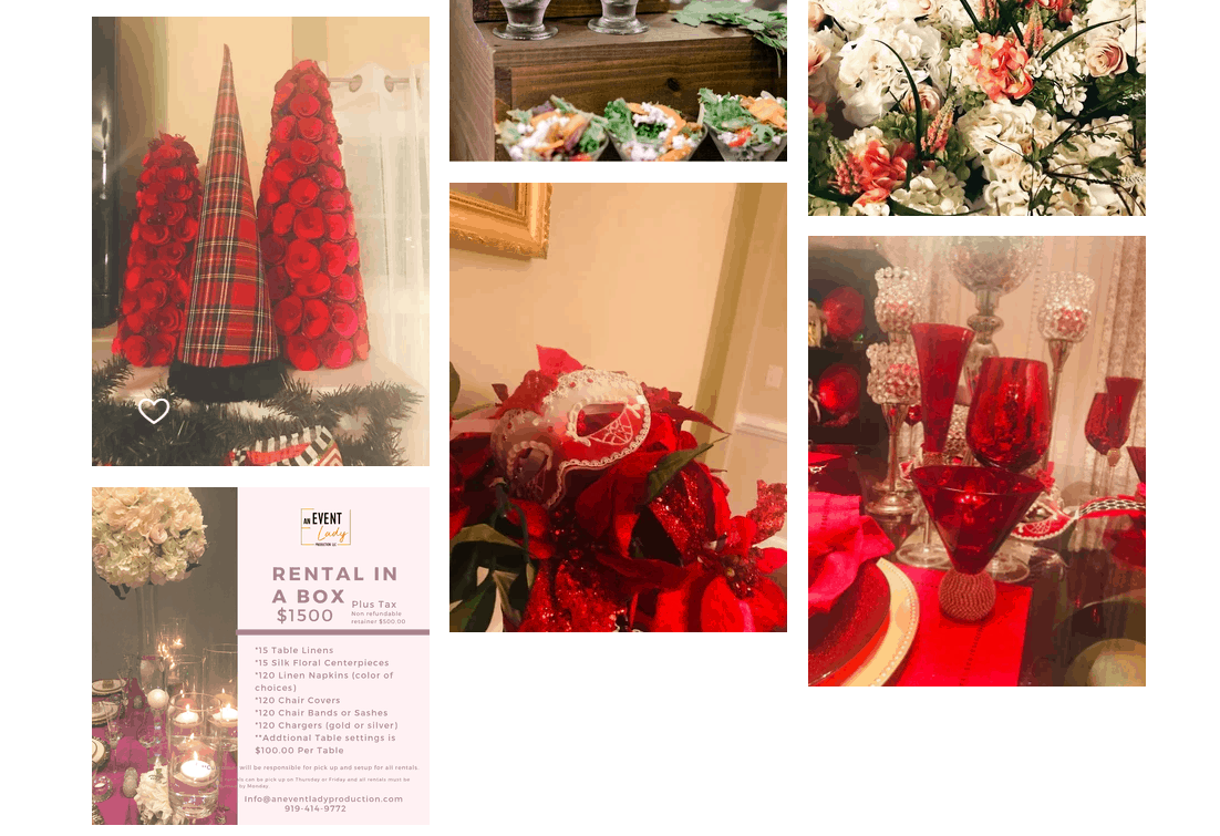
An Event Lady Production had some beautiful images from their past events and the images were expandable. Congrats on that!
Being a company that offers three different types of events however, I was expecting to see a gallery that was organized in those same categories, i.e. Weddings, Social and Corporate. I was also a little confused by the Rental in a Box image that was included in the Gallery. This seems to be a service offered by the company and should be included on the Services page.
Recommendation: Organize gallery by different types of events, that way potential clients can easily navigate to the images that are most applicable to what they are looking for.
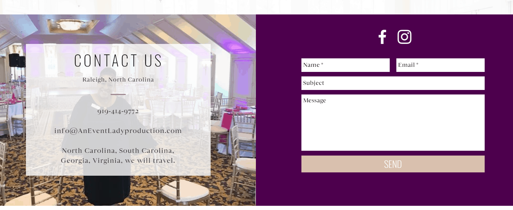
Contact Page – Website Review
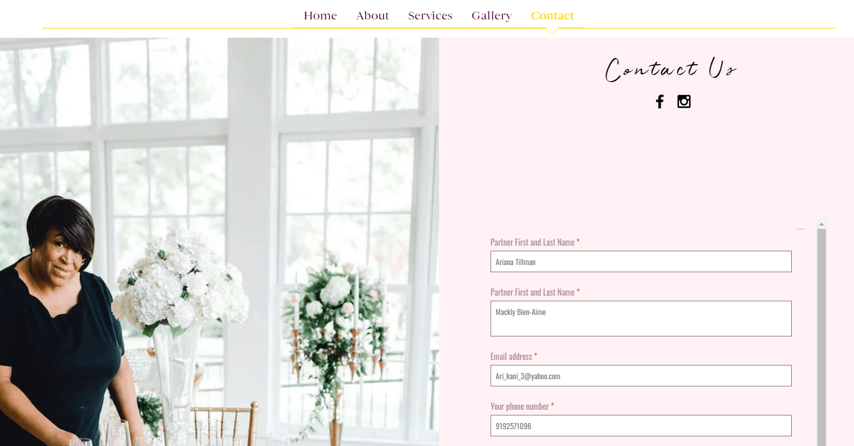
One of my favorite things about the contact page is that it included a picture of Angela, to again provide potential clients with an image of the person behind the business – well done.
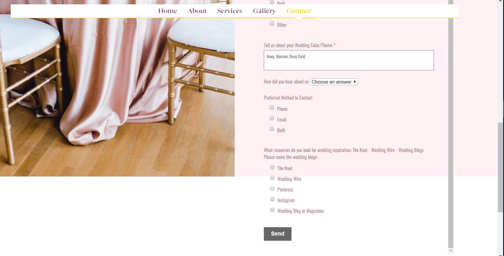
My least favorite area, however, it the frame on this page. When you scroll down the page, as you will see from the screenshot above on the right, the contact form starts to flow over the design and it does start looking like a glitch. This is often common in Wix websites.
As someone who works on a lot of client websites, I’m not a huge fan of Wix for this reason. Some of the Wix templates still use iFrames which are not always browser friendly. While Wix websites can be easy for clients designing their websites on their own, they can present some challenges in how they look to your potential clients.
Recommendation: Look into removing the iFrame or shortening the contact form to avoid the overflow. Below is an example of what happens when the Wix template used is not browser friendly or adjustable. You’ll notice that the website does not autofit to the browser when I decreased the window size.
Social Media Buttons
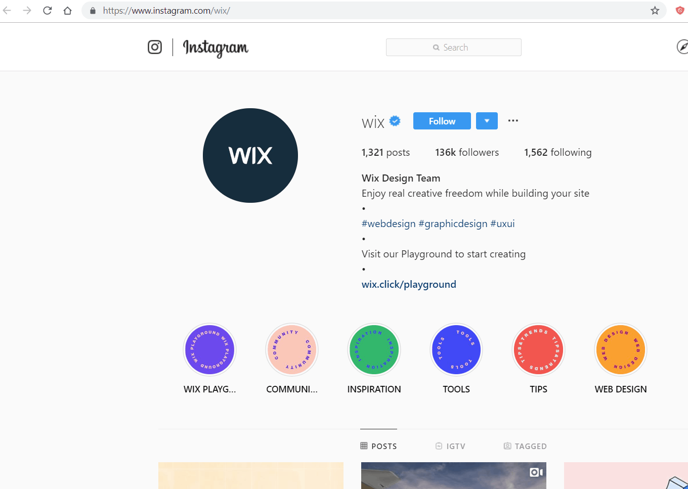
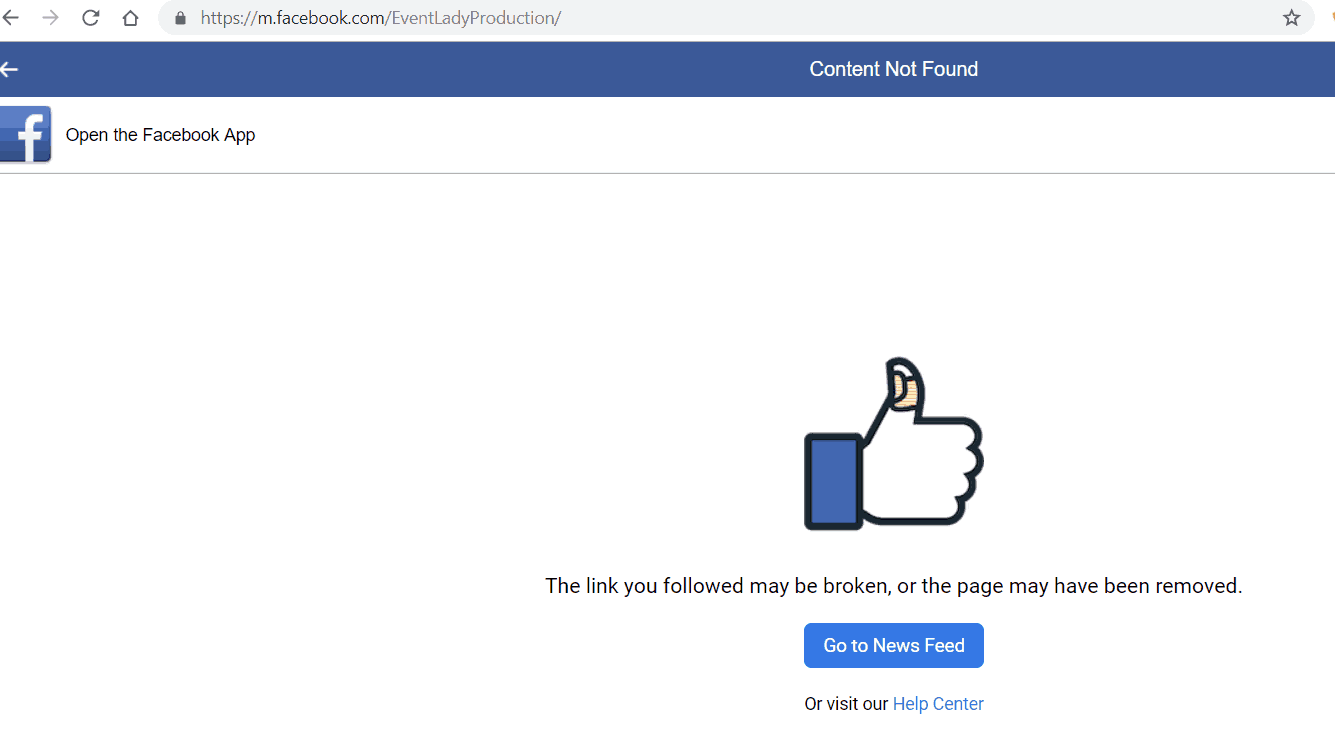
The social media buttons on some of the pages of the website are inconsistent. The Facebook button when selected goes to a Facebook error page. The Instagram button on the front page takes me to the company’s account, however on other pages this directed me to the Wix Instagram account.
Recommendation: Review and update all social media buttons to ensure they are correctly linked.
Instagram Review & Tips
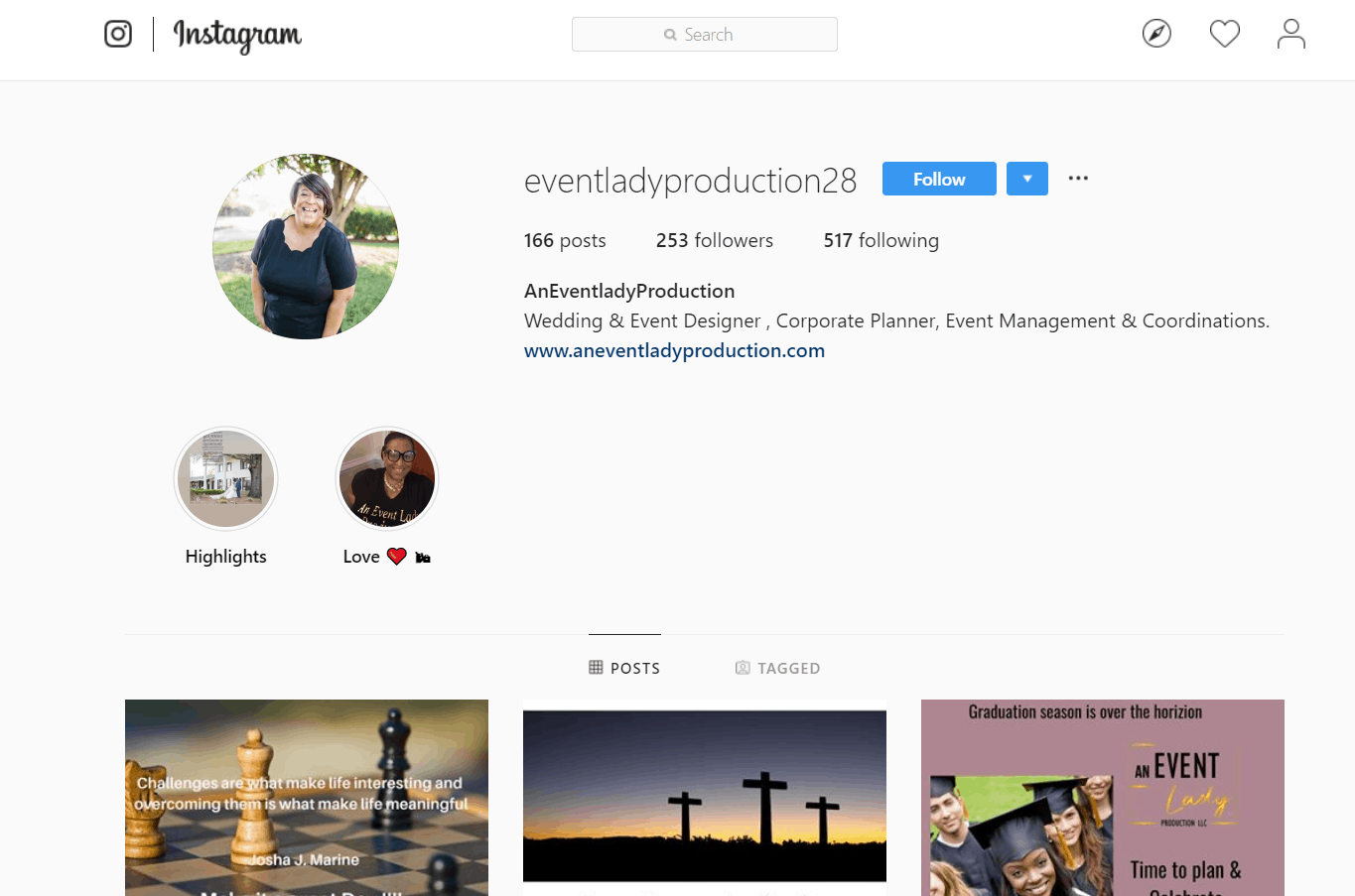
The first thing that greets you on An Event Lady Production’s Instagram account is Angela’s smiling face. This is perfect.
Tip #1:
The Title Name on the account, however, is all one word, which a client would not search for all together. My suggestion would be to change “AnEventladyProduction” to “An Event Lady Production”.
Tip #2:
The biography on the Instagram account does not follow my WWHOW principle. That is to answer, what you do, who you serve and how they can connect with you. I would rewrite this using the WWHOW technique.
Tip #3:
The account has two Instagram story highlights that are not being used effectively and that needs to be updated. The first highlight is called “Highlight” and includes 1 image with a list of tags over the image. The clients themselves are not clearly visible. This does not do an effective job of marketing the business. The second highlight is called “Love”, has an about me text and nothing else. I would also suggest removing this. I would instead share photos from your events in the highlights and title it “Behind the Scenes”, “BTS”, “Weddings” etc. Potential clients can then easily find and browse through the stories.
Tip #4:
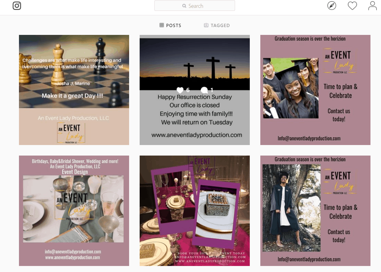
The images on this Instagram account are too busy. As a result of using multiple images with a mixture of fonts and photos, the Instagram feed starts looking cluttered. The first 6 images on your account are where clients get the first impression of your business. This does not do a very good job of showcasing an event planner’s portfolio. I would suggest stop using mixed media images. Instead, use an image only and then use the caption of the image to talk about your services. Your caption can also include a call to action, such as Contact us today. Here’s an example:
Tip #5 :
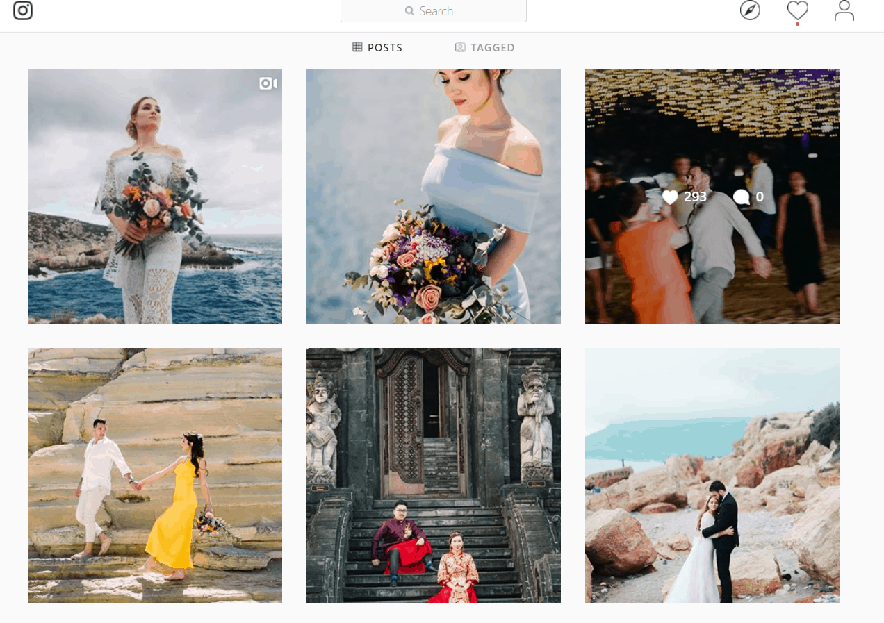
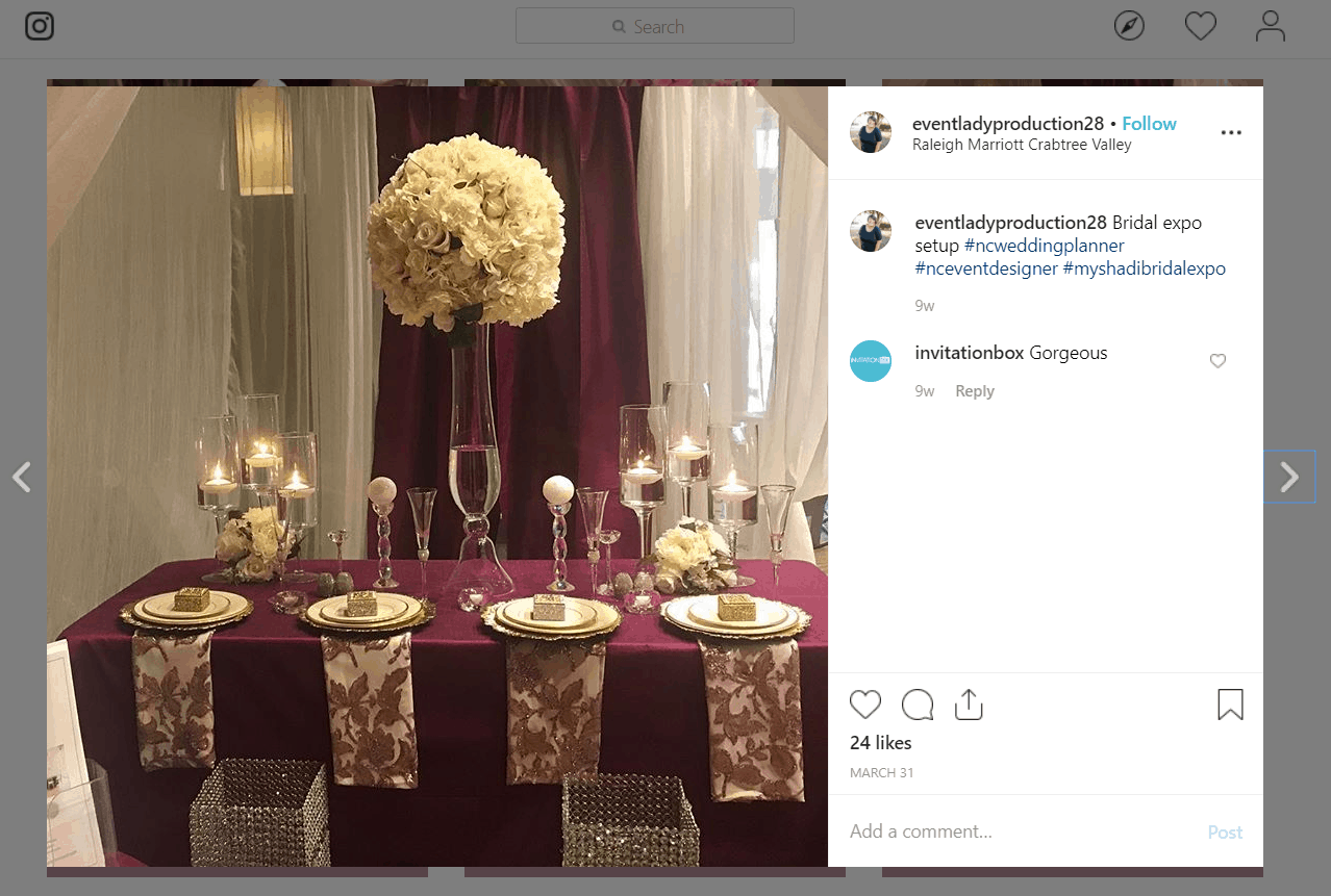
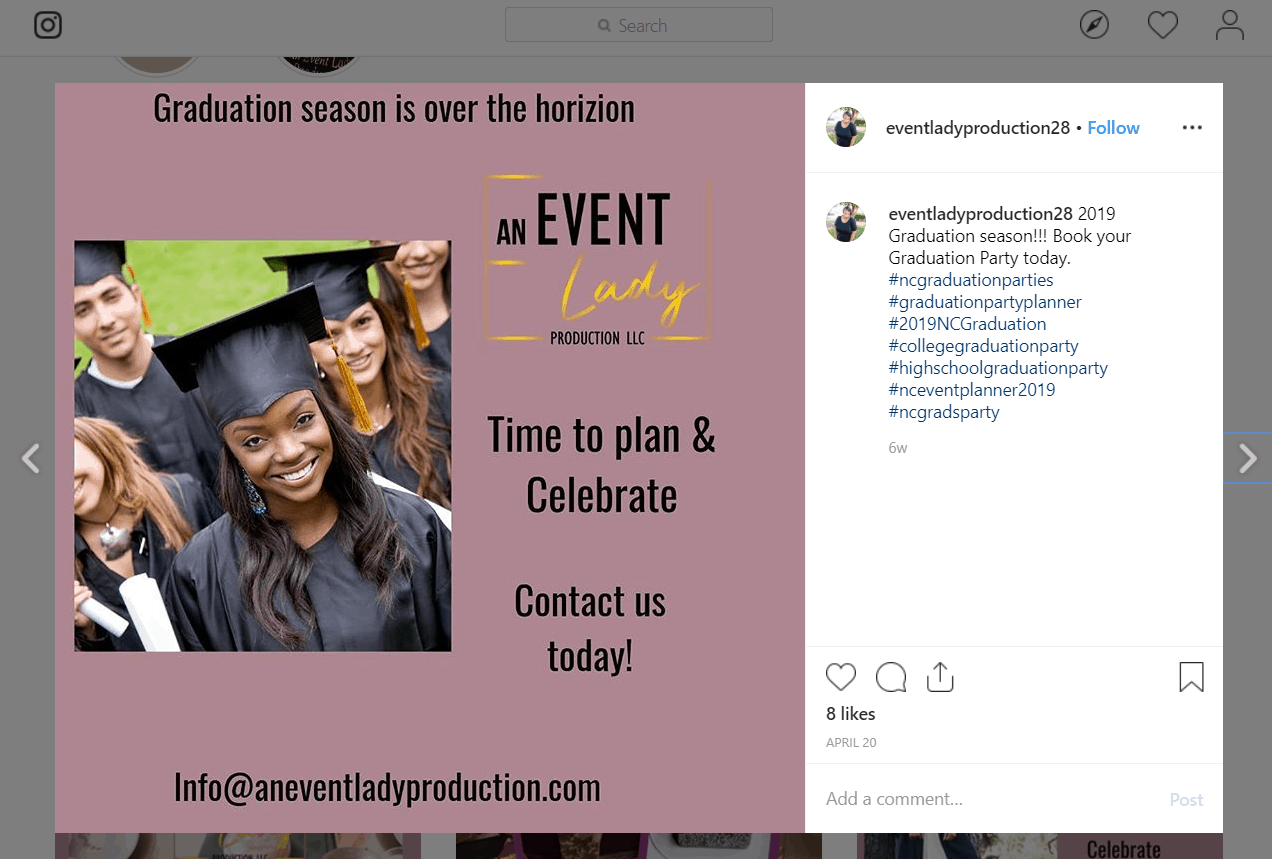
Keep doing what works best. It’s clear that photos from the company’s past events do much better than photos with text (see below). I would suggest posting more photos from events and using Canva to create simple, quote graphics (see example below).
If you would like your own website audit, be sure to grab a spot in my online marketing checkup. I can help you update your website and social media to start generating more event planning leads online.